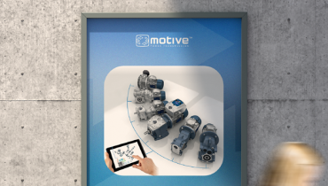
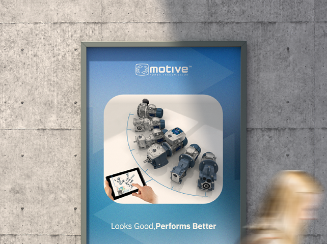
New Motive logo: the same motiv-ation, a new shape
A renewed visual identity that preserves our roots and strengthens our future direction within Green Silence Group.
We present our new logo: not just a graphic change, but a coherent expression of what has always defined us.
Since our foundation, our name has been a statement of intent. Motive is not just a brand: it is what drives us, our motiv-ation to create value and develop solutions that offer customers concrete “motives” to choose us.
Today this identity evolves in form, while remaining unchanged in substance.
The new logo introduces a bold and essential lettering, built on solid and contemporary geometries. It is not an aesthetic choice for its own sake, but a direct reflection of what we create. Like our products, it is designed to be clear, reliable, and recognizable over time. The clean lines express an engineering-driven, concrete, performance-oriented approach: the same logic that has always guided us—not to follow the market, but to help define it.
At the same time, the visual language integrates with Green Silence Group, strengthening a shared identity without losing Motive’s uniqueness. As already known, Motive is part of Green Silence Group, a technological hub that includes SETTIMA and SPIN. In recent years we have worked to develop increasingly innovative and sustainable solutions, such as the innovative SPINREL reluctance motor, providing integrated expertise capable of effectively meeting market needs.
With this evolution, we also aim to visually reinforce our connection with Green Silence Group.
Alongside the lettering, the pictogram represents the deepest continuity with our history. The arrows, a distinctive element of Motive, represent movement: the real movement of motors, gearboxes, and inverters, and the one that defines our way of working—based on research, development, and continuous transformation. It is not only dynamism, but direction: the ability to create new possibilities along the entire value chain, offering not just solutions but “motives” for growth to those who work with us. The pictogram evolves while remaining faithful to its meaning of a continuous cycle of innovation that generates value.
The payoff “power transmission” remains unchanged because it represents the core of Motive. Research, development, and innovation in Power Transmission guide every decision we make and enable us to create solutions adaptable to a global market, offering concrete opportunities to those who use them.
This new visual identity does not mark a break, but a conscious continuity. Motive has grown by creating value (“motives”) where others stopped, encouraging customers to choose something more. Today, the new logo expresses exactly this: a company that continues to evolve because it continues to have the same motiv-ations. This will continue to guide us into the future.